
I love color, especially tertiary colors like aubergine, mustard yellow, pumpkin, tomato red, teal and sage green; but the basic primaries and bright secondaries like orange and purple and green aren't really my thing, and don't show up very prominently in my non-transfer work. The color palettes I gravitate to are muted, semi-transparent colors created from translucent clay and alcohol ink.
I visit artists' websites all the time and see all these vibrant pinks and purples and yellows and oranges and greens and blues, but I tend to talk myself out of using them. I see color like that, especially a riot of color in one piece, and the first thing that comes to mind is "LOUD!!!!!!!!!!!!!"
I would be happy with a roomful of translucent clay and alcohol ink. Really, I could live the rest of my life just using those; and as long as Ranger doesn't run out of Walnut Stain Distressed embossing powder, I'm set. I don't even like silver all that much, and prefer to use it only as a backing. I usually use gold as a backing or as a means to create my signature antique brass and copper blends.
Just like my Momma's pimento cheese is my comfort food, my little stash of antique brass and copper blends are my comfort clay, but I set out this weekend to push that envelope that artists are supposed to push. I made the 200 mile round trip to the "local" craft store and bought some Premo Purple, Orange, Fuchsia, Cadmium Yellow, Cobalt Blue, and Candy Pink. Oh, and please forgive a mini rant here, but whomever invented flourescent polymer clay should be strung up by his toenails. Good Gawd. To each his own, I reckon, but with polymer clay struggling for respectability and recognition as a serious artistic medium, do we really need glow-in-the-dark clay?
I came back and put the new colors out on my worktable and circled around them for what seemed like hours, waiting for divine inspiration as to what to do with them, before finally opening the Purple and Fuchsia. I just couldn't quite bring myself to tackle the pepto bismol pink.
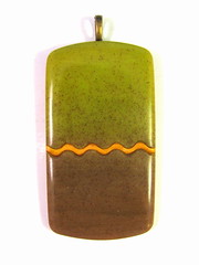
 Six hours later, most of what I ended up with went in the trash or the Butt Uglies Jar (oh, and we're up to 25 gallon jar #8, by the way.) This purple marbled piece was actually the best of the bunch. No lie. My mother loves purple and will have a field day with the jar, about the only good thing that came of my color experiment; and the sea green, the cobalt, and especially the cadmium yellow and candy pink have been consigned to the back of the clay drawer, the very back, behind the dried-out, never-to-be-used-again Studio clay.
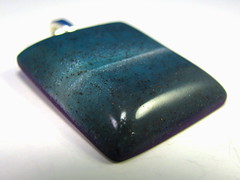
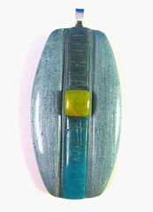
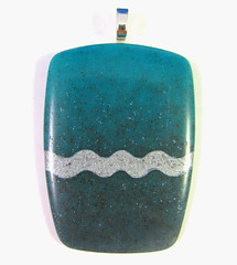
I went back to the translucent clay and alcohol inks. I did get a really bright, lime green, and a really lovely carribbean blue, even an icy/silvery blue piece.
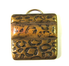

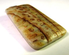

Then to make myself feel less guilty about wasting two whole days with nothing to show for it, I played with some stamps I just got from my friend Tonja Lenderman, of Tonja's Treasures at Etsy. I LOVE her leopard print stamp, and her wormwood stamp, which I think will make a great faux palm jasper.
I guess there are worse things than being a color snob.
7 comments:
Ah...but you see...us 'mere mortals' that play with clay...would love to tip all your 'butt uglies'out on the ground and roll around in them...LOL. coz I bet that arent even ugly. Good for you pushing those boundaries. I love what you have come up with...especially the restful blues.
I agree. Most of the time I can't bring myself to use "true" colors; I almost always blend a bit of the complementary color in to gray down the color. Even my items that look somewhat bright are never the color as it comes out of the package.
As for the alcohol inks, I have never figured out what to do with them!
You're not a snob, you're an Autumn. I'm a Spring, and revel in coral pink, turquoise, prussian blue, emerald . . .
Julz, thank you my dear, but they really are so ugly only my mother could love them. She says they are like photos of your children. Even if they're bad, you never throw away photos of your children. LOL
Rebecca, happy to have another member of Color Snobs R Us. :)
Sylvia, thank you for the explanation. I hope I didn't offend with my observations. I actually had my "colors" done for makeup and wardrobe once, and turned out to be a classic Winter. Go figure! LOL
With the exception of pearl white,I don't think I've ever used clay right out of the package!
I HAVE to mix the clay into other shades !!!
Do you think I have some sort of "condition" ?
Is there a color mixer support group? Maybe we need to start one... LOL!
I love to see bright pieces made with pure primary colors!
I just don't make them myself.
Even if I make something bright, I mix the shades to suit my taste.
If I ever decide to fix my mix-mania, I might try little steps at first .Maybe buy the smallest box of crayola crayons and make myself draw with just those primary colors ...no blending !!!
Lynda, I always LOVE the colors you work with !!!
m.e .:)
Maybe that colour palette is just your unique signature? Nothing wrong with that :).
Pushing boundaries is one thing but I learned the hard way that pushing them for the sake of it can make an artist really unhappy! :P
I love then new pendants, the blue ones being my favourites :)
I have not been "playing' with clay for some time now and want to do so. Everytime I go to my studio, I always gravitate towards the warmer colors. Always thinking WHY can't I use bright livly colors???? Glad to know I don't have a problem....I love your color palette!!
Anne White
Post a Comment