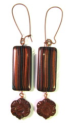
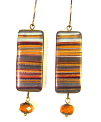
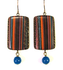
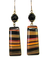
I tried really hard this weekend to make myself use more bold brights and primary colors in my work. I realized recently that the only time I really use a lot of really vibrant color is when I'm doing image transfers.
I love color, especially tertiary colors like aubergine, mustard yellow, pumpkin, tomato red, teal and sage green; but the basic primaries and bright secondaries like orange and purple and green aren't really my thing, and don't show up very prominently in my non-transfer work. The color palettes I gravitate to are muted, semi-transparent colors created from translucent clay and alcohol ink.
I visit artists' websites all the time and see all these vibrant pinks and purples and yellows and oranges and greens and blues, but I tend to talk myself out of using them. I see color like that, especially a riot of color in one piece, and the first thing that comes to mind is "LOUD!!!!!!!!!!!!!"
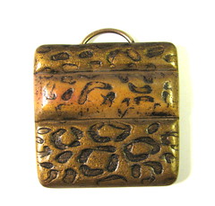
I would be happy with a roomful of translucent clay and alcohol ink. Really, I could live the rest of my life just using those; and as long as Ranger doesn't run out of Walnut Stain Distressed embossing powder, I'm set. I don't even like silver all that much, and prefer to use it only as a backing. I usually use gold as a backing or as a means to create my signature antique brass and copper blends.
Just like my Momma's pimento cheese is my comfort food, my little stash of antique brass and copper blends are my comfort clay, but I set out this weekend to push that envelope that artists are supposed to push. I made the 200 mile round trip to the "local" craft store and bought some Premo Purple, Orange, Fuchsia, Cadmium Yellow, Cobalt Blue, and Candy Pink. Oh, and please forgive a mini rant here, but whomever invented flourescent polymer clay should be strung up by his toenails. Good Gawd. To each his own, I reckon, but with polymer clay struggling for respectability and recognition as a serious artistic medium, do we really need glow-in-the-dark clay?
I came back and put the new colors out on my worktable and circled around them for what seemed like hours, waiting for divine inspiration as to what to do with them, before finally opening the Purple and Fuchsia. I just couldn't quite bring myself to tackle the pepto bismol pink.

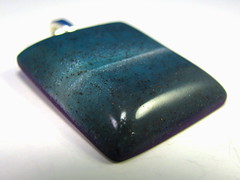
Six hours later, most of what I ended up with went in the trash or the Butt Uglies Jar (oh, and we're up to 25 gallon jar #8, by the way.) This purple marbled piece was actually the best of the bunch. No lie. My mother loves purple and will have a field day with the jar, about the only good thing that came of my color experiment; and the sea green, the cobalt, and especially the cadmium yellow and candy pink have been consigned to the back of the clay drawer, the very back, behind the dried-out, never-to-be-used-again Studio clay.


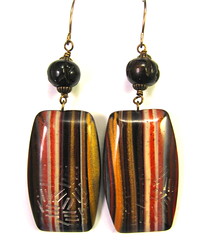
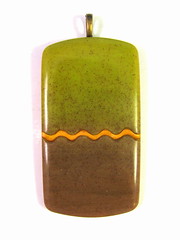
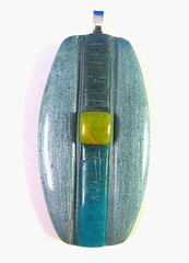
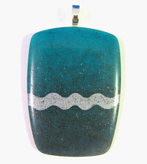
I went back to the translucent clay and alcohol inks. I did get a really bright, lime green, and a really lovely carribbean blue, even an icy/silvery blue piece.


Then to make myself feel less guilty about wasting two whole days with nothing to show for it, I played with some stamps I just got from my friend Tonja Lenderman, of
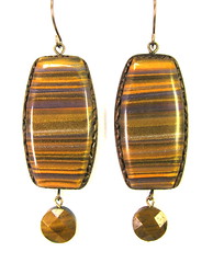
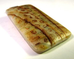
Tonja's Treasures at Etsy. I LOVE her leopard print stamp, and her wormwood stamp, which I think will make a great faux palm jasper.
I guess there are worse things than being a color snob.
